IT Service Desk Analysis
Personal project · Python / pandas · 1M tickets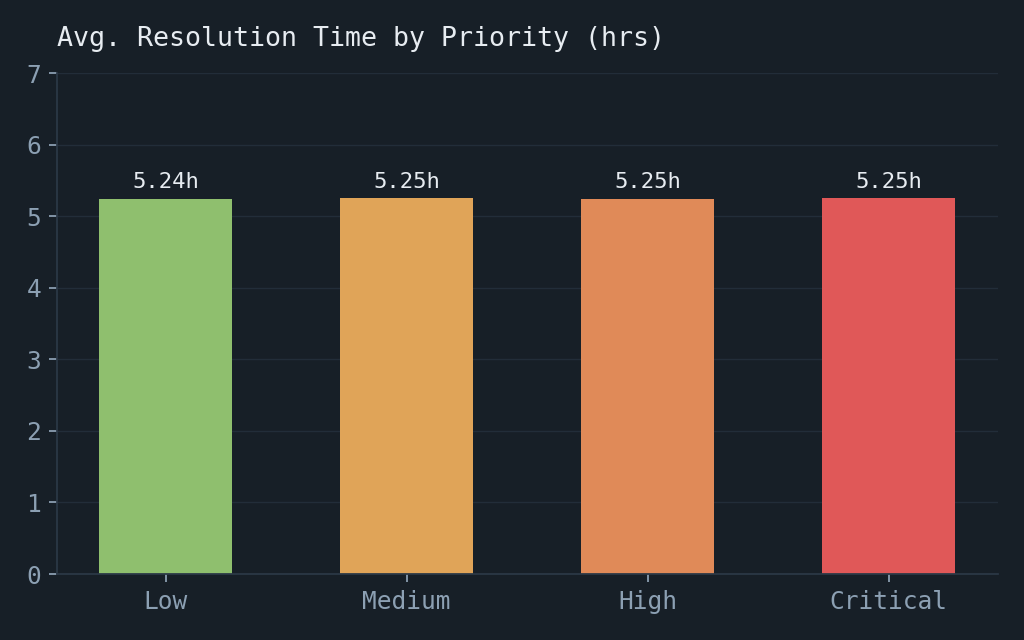
Resolution time by priority
~5.25 hours across every priority level — a signal that priority was not changing outcomes.
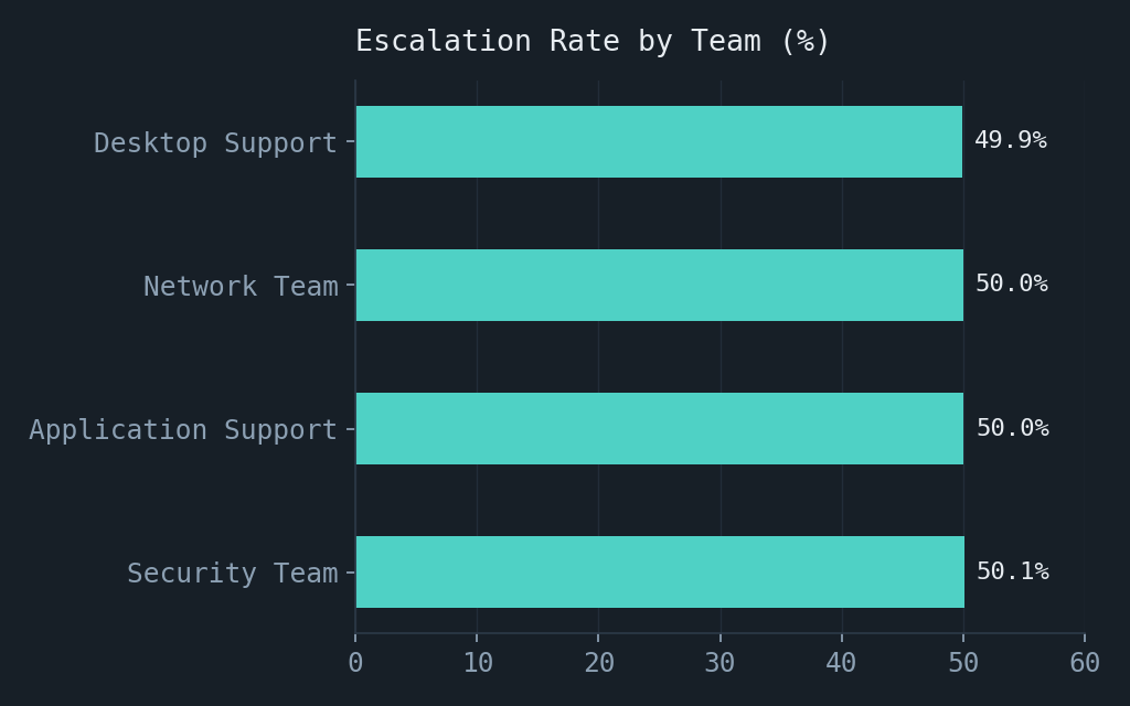
Escalation by team
All four teams cluster around the same ~50% escalation rate.
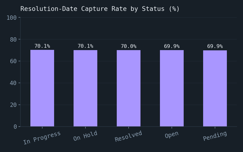
Resolution-date completeness
About 30% of records lack a resolution timestamp, including tickets marked Resolved.
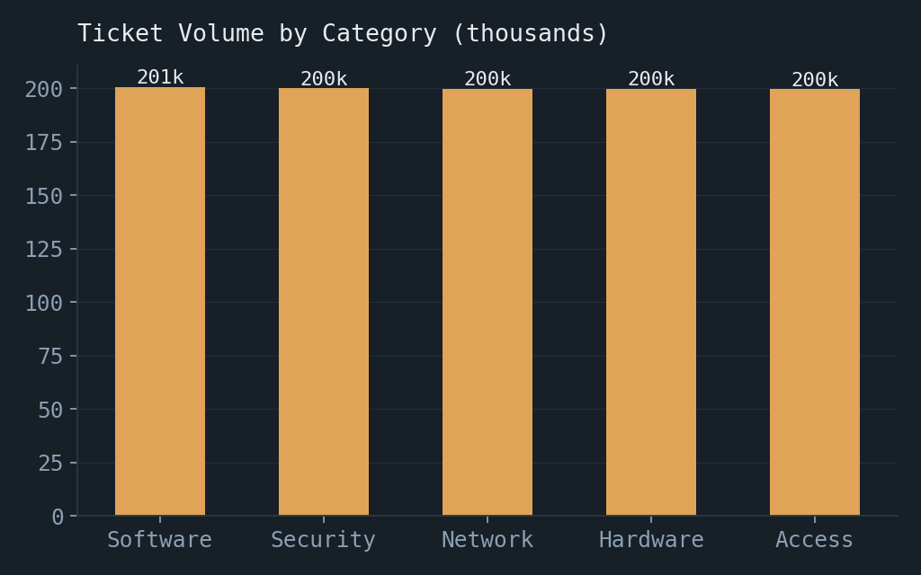
Volume by category
An even distribution across five categories makes category alone a weak explanation for the flat outcome.
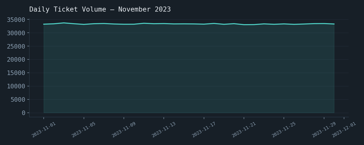
Daily ticket volume
Consistent daily intake with no strong trend across the month.